Below is a comparison of how a data model of my $ – USD Growth Portfolio compares to other popular portfolios over the last few years. As you can see, the % returns and drawdowns are better than the original Harry Browne Permanent Portfolio.
Portfolio 1 is my current USD Growth Portfolio Allocation (US Stocks, US Bonds, Gold, US REITs).
Portfolio 2 is the original Harry Browne’s Permanent Portfolio mix: US Stocks, US Bonds, Gold . Cash has been left out, as I think that skews it to the downside unfairly. Here is also a link to my USD Permanent Portfolio which I track monthly here on my website.
Portfolio 3 is made up of a 50/50 mix of US Stocks & US Bonds using ETF’s.
The S&P ETF is there as a representation of the US Stock Market Baseline.
NOTE: The returns shown in this simulation are INFLATION ADJUSTED meaning they are returns after inflation. The returns shown in my portfolios are BEFORE inflation.

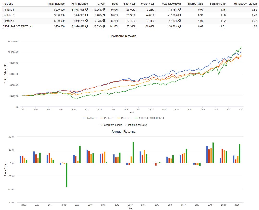
BALANCES shown are just there to show growth as an example. They are not actual portfolio values.
—
If you would like to read about backtesting, see my Backtesting page.